
In a previous post, we covered how to use Latent Growth Modeling in R to examine change in time. In that post, we assumed a simple linear model, which is often unrealistic. Here, I am going to show how we can free this assumption and find the best way to treat change in time.
We can use exploratory analysis and previous research to understand how to model change in time. Moreover, we can also compare models that treat change in time in different ways to find the best fit for our data.
If we look again at the log income in the Understanding Society data, we get this graph (see previous post for an explanation of the data and how it is structured):
ggplot(usl, aes(wave, logincome, group = pidp)) +
  geom_line(alpha = 0.01) + # add individual line with transparency
  stat_summary( # add average line
    aes(group = 1),
    fun = mean,
    geom = "line",
    size = 1.5,
    color = "red"
  ) +
  theme_bw() + # nice theme
  labs(x = "Wave", y = "Logincome") # nice labels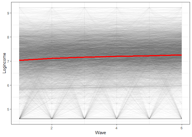
The graph would indicate we have an average change that is overall linear with a slight downward bend.
To see the individual level change, I also sampled 20 individuals and plotted each one’s change in income.
# sample 20 ids
people <- unique(usl$pidp) %>% sample(20)

# do separate graph for each individual
usl %>%
  filter(pidp %in% people) %>%  # filter only sampled cases
  ggplot(aes(wave, logincome, group = 1)) +
  geom_line() +
  facet_wrap(~pidp) + # a graph for each individual
  theme_bw() + # nice theme
  labs(x = "Wave", y = "Logincome") # nice labels
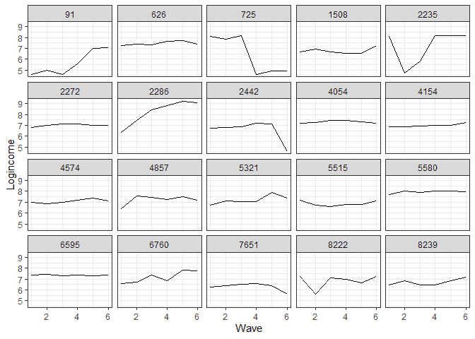
It appears that at the individual level, we have a more mixed bag, although linear change would not be a bad approximation for quite a few people.
Keeping this in mind, we can also decide on the best way to model change in time by comparing several different models and seeing which fits the data best. As a starting point, we can run the linear model, which will be our reference (see previous post for an explanation of the model and syntax):
library(tidyverse)
library(lavaan)


# first LGM
model <- 'i =~ 1*logincome_1 + 1*logincome_2 + 1*logincome_3 +
                  1*logincome_4 + 1*logincome_5 + 1*logincome_6
          s =~ 0*logincome_1 + 1*logincome_2 + 2*logincome_3 +
                  3*logincome_4 + 4*logincome_5 + 5*logincome_6'

fit1 <- growth(model, data = usw)

summary(fit1, standardized = TRUE)

## lavaan 0.6-8 ended normally after 45 iterations
##
##   Estimator                                         ML
##   Optimization method                           NLMINB
##   Number of model parameters                        11
##
##   Number of observations                          8752
##
## Model Test User Model:
##
##   Test statistic                               523.408
##   Degrees of freedom                                16
##   P-value (Chi-square)                           0.000
##
## Parameter Estimates:
##
##   Standard errors                             Standard
##   Information                                 Expected
##   Information saturated (h1) model          Structured
##
## Latent Variables:
##                    Estimate  Std.Err  z-value  P(>|z|)   Std.lv  Std.all
##   i =~
##     logincome_1       1.000                               0.827    0.842
##     logincome_2       1.000                               0.827    0.923
##     logincome_3       1.000                               0.827    0.949
##     logincome_4       1.000                               0.827    0.977
##     logincome_5       1.000                               0.827    0.993
##     logincome_6       1.000                               0.827    0.949
##   s =~
##     logincome_1       0.000                               0.000    0.000
##     logincome_2       1.000                               0.115    0.128
##     logincome_3       2.000                               0.229    0.263
##     logincome_4       3.000                               0.344    0.406
##     logincome_5       4.000                               0.459    0.551
##     logincome_6       5.000                               0.574    0.658
##
## Covariances:
##                    Estimate  Std.Err  z-value  P(>|z|)   Std.lv  Std.all
##   i ~~
##     s                -0.047    0.002  -25.789    0.000   -0.497   -0.497
##
## Intercepts:
##                    Estimate  Std.Err  z-value  P(>|z|)   Std.lv  Std.all
##    .logincome_1       0.000                               0.000    0.000
##    .logincome_2       0.000                               0.000    0.000
##    .logincome_3       0.000                               0.000    0.000
##    .logincome_4       0.000                               0.000    0.000
##    .logincome_5       0.000                               0.000    0.000
##    .logincome_6       0.000                               0.000    0.000
##     i                 7.063    0.010  734.511    0.000    8.538    8.538
##     s                 0.041    0.002   23.527    0.000    0.354    0.354
##
## Variances:
##                    Estimate  Std.Err  z-value  P(>|z|)   Std.lv  Std.all
##    .logincome_1       0.280    0.006   45.748    0.000    0.280    0.291
##    .logincome_2       0.201    0.004   48.502    0.000    0.201    0.250
##    .logincome_3       0.212    0.004   54.736    0.000    0.212    0.279
##    .logincome_4       0.197    0.004   54.733    0.000    0.197    0.275
##    .logincome_5       0.176    0.004   49.002    0.000    0.176    0.254
##    .logincome_6       0.217    0.005   43.584    0.000    0.217    0.286
##     i                 0.684    0.012   55.548    0.000    1.000    1.000
##     s                 0.013    0.000   31.248    0.000    1.000    1.000
Based on this model, log income is, on average, around 7.063 (~ £1,168) at the start of the study and goes up by 0.041 each wave (for more on the interpretation, see the previous post).
We can also visualize the change in time based on our model (again, check the previous post for explanations).
# predict the two latent variables
pred_lgm <- predict(fit1)

# create long data for each individual
pred_lgm_long <- map(0:5, # loop over time
                     function(x) pred_lgm[, 1] + x * pred_lgm[, 2]) %>%
  reduce(cbind) %>% # bring together the wave predictions
  as.data.frame() %>% # make data frame
  setNames(str_c("Wave ", 1:6)) %>% # give names to variables
  mutate(id = row_number()) %>% # make unique id
  gather(-id, key = wave, value = pred) # make long format

# make graph (takes a minute to plot)
pred_lgm_long %>%
  ggplot(aes(wave, pred, group = id)) + # what variables to plot?
  geom_line(alpha = 0.01) + # add a transparent line for each person
  stat_summary( # add average line
    aes(group = 1),
    fun = mean,
    geom = "line",
    size = 1.5,
    color = "red"
  ) +
  theme_bw() + # makes graph look nicer
  labs(y = "logincome", # labels
       x = "Wave")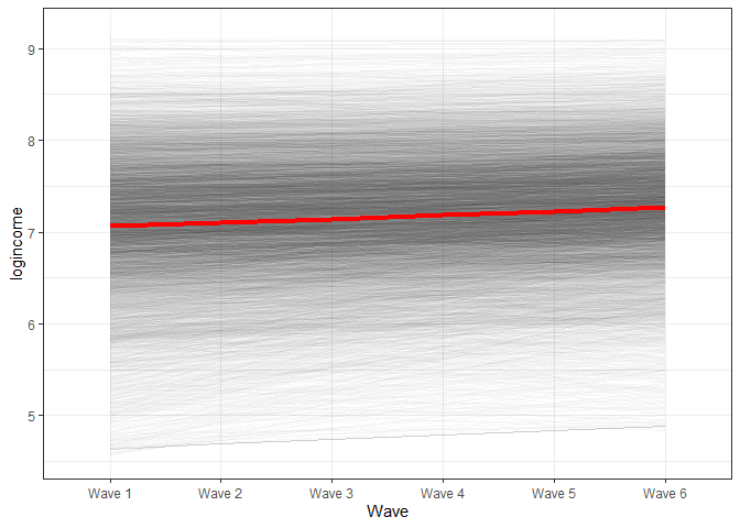
There are two general ways to expand this model to include non-linear change. One is by including polynomials while the other is by looking at relative change in time. We will cover both below.
Estimating non-linear LGM using polynomials
Including polynomials to model nonlinear effects has a similar motivation to regression modelling. A polynomial (or interaction) allows the effect to change depending on the values of a predictor. In the case of LGM, this would mean that we allow the slope to be higher or lower as time passes. This, in effect, would bend the trend upwards or downwards. If we want to allow for multiple bends, then we need to include multiple polynomials. Below, we will include just the square effects modelled as a latent variable “q” (but the model can be easily expanded to include cubed effects and so on).
# square LGM
model <- 'i =~ 1*logincome_1 + 1*logincome_2 + 1*logincome_3 +
                  1*logincome_4 + 1*logincome_5 + 1*logincome_6
          s =~ 0*logincome_1 + 1*logincome_2 + 2*logincome_3 +
                  3*logincome_4 + 4*logincome_5 + 5*logincome_6
          q =~ 0*logincome_1 + 1*logincome_2 + 4*logincome_3 +
                  9*logincome_4 + 16*logincome_5 + 25*logincome_6'

fit2 <- growth(model, data = usw)

summary(fit2, standardized = TRUE)

## lavaan 0.6-8 ended normally after 93 iterations
##
##   Estimator                                         ML
##   Optimization method                           NLMINB
##   Number of model parameters                        15
##
##   Number of observations                          8752
##
## Model Test User Model:
##
##   Test statistic                               168.391
##   Degrees of freedom                                12
##   P-value (Chi-square)                           0.000
##
## Parameter Estimates:
##
##   Standard errors                             Standard
##   Information                                 Expected
##   Information saturated (h1) model          Structured
##
## Latent Variables:
##                    Estimate  Std.Err  z-value  P(>|z|)   Std.lv  Std.all
##   i =~
##     logincome_1       1.000                               0.843    0.877
##     logincome_2       1.000                               0.843    0.930
##     logincome_3       1.000                               0.843    0.956
##     logincome_4       1.000                               0.843    0.985
##     logincome_5       1.000                               0.843    1.002
##     logincome_6       1.000                               0.843    0.991
##   s =~
##     logincome_1       0.000                               0.000    0.000
##     logincome_2       1.000                               0.271    0.299
##     logincome_3       2.000                               0.541    0.614
##     logincome_4       3.000                               0.812    0.949
##     logincome_5       4.000                               1.082    1.287
##     logincome_6       5.000                               1.353    1.590
##   q =~
##     logincome_1       0.000                               0.000    0.000
##     logincome_2       1.000                               0.046    0.051
##     logincome_3       4.000                               0.185    0.210
##     logincome_4       9.000                               0.417    0.487
##     logincome_5      16.000                               0.741    0.881
##     logincome_6      25.000                               1.158    1.361
##
## Covariances:
##                    Estimate  Std.Err  z-value  P(>|z|)   Std.lv  Std.all
##   i ~~
##     s                -0.080    0.006  -12.637    0.000   -0.351   -0.351
##     q                 0.005    0.001    5.051    0.000    0.136    0.136
##   s ~~
##     q                -0.011    0.001  -14.993    0.000   -0.893   -0.893
##
## Intercepts:
##                    Estimate  Std.Err  z-value  P(>|z|)   Std.lv  Std.all
##    .logincome_1       0.000                               0.000    0.000
##    .logincome_2       0.000                               0.000    0.000
##    .logincome_3       0.000                               0.000    0.000
##    .logincome_4       0.000                               0.000    0.000
##    .logincome_5       0.000                               0.000    0.000
##    .logincome_6       0.000                               0.000    0.000
##     i                 7.039    0.010  701.030    0.000    8.354    8.354
##     s                 0.071    0.005   14.233    0.000    0.261    0.261
##     q                -0.006    0.001   -6.317    0.000   -0.124   -0.124
##
## Variances:
##                    Estimate  Std.Err  z-value  P(>|z|)   Std.lv  Std.all
##    .logincome_1       0.213    0.008   26.812    0.000    0.213    0.231
##    .logincome_2       0.207    0.004   49.387    0.000    0.207    0.252
##    .logincome_3       0.196    0.004   50.313    0.000    0.196    0.253
##    .logincome_4       0.178    0.004   48.924    0.000    0.178    0.243
##    .logincome_5       0.178    0.004   49.022    0.000    0.178    0.252
##    .logincome_6       0.173    0.007   25.732    0.000    0.173    0.239
##     i                 0.710    0.014   49.658    0.000    1.000    1.000
##     s                 0.073    0.004   16.951    0.000    1.000    1.000
##     q                 0.002    0.000   15.218    0.000    1.000    1.000
It appears that initially, log income goes up by 0.071 each wave, but as time passes, this bends downwards (because the square effect is negative) by 0.006 each wave. The variance of “q” (0.002) is the between variation in non-linear change. Substantively, it tells us if people have different non-linear bends in time. If this is 0, everyone follows the same non-linear trend. If the value is large, individuals are very different in the non-linear part of the change in time of income.
Next, we plot the new estimates of change from the new model. We will use a procedure similar to the one above. The main change is to the formula. Now, we need to add a new term, which is time squared (x^2) multiplied by the coefficient for the square effect (pred_lgm2[, 3]). We also added the line from the linear model for comparison.
# predict scores
pred_lgm2 <- predict(fit2)

# create long data for each individual
pred_lgm2_long <- map(0:5, # loop over time
                      function(x) pred_lgm2[, 1] +
                        x * pred_lgm2[, 2] +
                        x^2 * pred_lgm2[, 3]) %>%
  reduce(cbind) %>% # bring together the wave predictions
  as.data.frame() %>% # make data frame
  setNames(str_c("Wave ", 1:6)) %>% # give names to variables
  mutate(id = row_number()) %>% # make unique id
  gather(-id, key = wave, value = pred) # make long format

# make graph
pred_lgm2_long %>%
  ggplot(aes(wave, pred, group = id)) + # what variables to plot?
  geom_line(alpha = 0.01) + # add a transparent line for each person
  stat_summary( # add average line
    aes(group = 1),
    fun = mean,
    geom = "line",
    size = 1.5,
    color = "blue"
  ) +
  stat_summary(data = pred_lgm_long, # add average from linear model
               aes(group = 1),
               fun = mean,
               geom = "line",
               size = 1.5,
               color = "red",
               alpha = 0.5
  ) +
  theme_bw() + # makes graph look nicer
  labs(y = "logincome", # labels
       x = "Wave")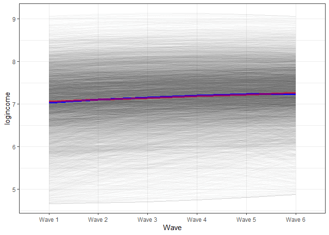
In the graph, we see that the blue line (based on the model with the squared effects) starts slightly below the red line, by the middle is slightly above and in the end, is somewhat lower. That being said, you need to squint your eyes to see a difference. While the square effects are significant, they might not be of substantive interest.
Non-linear change in time using relative change
The alternative way to model non-linear change is to estimate relative change. This is similar in spirit to including dummy variables in a regression model. The only thing we need to do is to tweak the loadings for the slope latent variable. We will fix only the first and last loading to 0 and 1. The rest of the loadings will not be fixed and will be estimated. Now, the interpretation of the slope will be the total amount of change from the first wave to the last one. The newly estimated loadings will tell us the proportion of change from the start until that point out of the total change observed.
# relative change LGM
model <- 'i =~ 1*logincome_1 + 1*logincome_2 + 1*logincome_3 +
                  1*logincome_4 + 1*logincome_5 + 1*logincome_6
          s =~ 0*logincome_1 + logincome_2 + logincome_3 +
                  logincome_4 + logincome_5 + 1*logincome_6'

fit3 <- growth(model, data = usw)

summary(fit3, standardized = TRUE)

## lavaan 0.6-8 ended normally after 113 iterations
##
##   Estimator                                         ML
##   Optimization method                           NLMINB
##   Number of model parameters                        15
##
##   Number of observations                          8752
##
## Model Test User Model:
##
##   Test statistic                               413.271
##   Degrees of freedom                                12
##   P-value (Chi-square)                           0.000
##
## Parameter Estimates:
##
##   Standard errors                             Standard
##   Information                                 Expected
##   Information saturated (h1) model          Structured
##
## Latent Variables:
##                    Estimate  Std.Err  z-value  P(>|z|)   Std.lv  Std.all
##   i =~
##     logincome_1       1.000                               0.821    0.838
##     logincome_2       1.000                               0.821    0.914
##     logincome_3       1.000                               0.821    0.939
##     logincome_4       1.000                               0.821    0.971
##     logincome_5       1.000                               0.821    0.988
##     logincome_6       1.000                               0.821    0.930
##   s =~
##     logincome_1       0.000                               0.000    0.000
##     logincome_2       0.158    0.023    6.977    0.000    0.081    0.091
##     logincome_3       0.410    0.017   23.519    0.000    0.212    0.242
##     logincome_4       0.718    0.017   43.392    0.000    0.370    0.438
##     logincome_5       0.958    0.020   48.368    0.000    0.494    0.595
##     logincome_6       1.000                               0.516    0.585
##
## Covariances:
##                    Estimate  Std.Err  z-value  P(>|z|)   Std.lv  Std.all
##   i ~~
##     s                -0.202    0.011  -19.018    0.000   -0.477   -0.477
##
## Intercepts:
##                    Estimate  Std.Err  z-value  P(>|z|)   Std.lv  Std.all
##    .logincome_1       0.000                               0.000    0.000
##    .logincome_2       0.000                               0.000    0.000
##    .logincome_3       0.000                               0.000    0.000
##    .logincome_4       0.000                               0.000    0.000
##    .logincome_5       0.000                               0.000    0.000
##    .logincome_6       0.000                               0.000    0.000
##     i                 7.070    0.010  719.672    0.000    8.616    8.616
##     s                 0.174    0.008   20.993    0.000    0.337    0.337
##
## Variances:
##                    Estimate  Std.Err  z-value  P(>|z|)   Std.lv  Std.all
##    .logincome_1       0.286    0.008   37.707    0.000    0.286    0.298
##    .logincome_2       0.189    0.005   37.392    0.000    0.189    0.235
##    .logincome_3       0.211    0.004   53.437    0.000    0.211    0.277
##    .logincome_4       0.193    0.004   53.163    0.000    0.193    0.270
##    .logincome_5       0.159    0.004   37.667    0.000    0.159    0.231
##    .logincome_6       0.243    0.005   44.710    0.000    0.243    0.312
##     i                 0.673    0.013   50.205    0.000    1.000    1.000
##     s                 0.266    0.013   21.250    0.000    1.000    1.000
So, based on these results from wave 1 to wave 6, income has increased, on average, by 0.174. If we had a genuinely linear change, we would expect the loadings to increase at the same rate of 0.2 per wave (five steps going from wave 1 to six out of a total change of 1 (the value of the last loading)). So the loading for “logincom_2” should be 0.2, the next, 0.4, and so on. We don’t see that. We see that the most change happened between waves 3 and 4. Then, around 30% of the total change happened ((0.718 – 0.410) * 100). On the other hand, very little change occurred between waves 5 and 6, less than 5%. This result would indicate that we don’t have linear change. We can visualize the change using a graph.
We need to extract the loadings to make a nice graph using the formula. We can use the parameterestimates() command to do that:
parameterestimates(fit3)

##            lhs op         rhs    est    se       z pvalue ci.lower ci.upper
## 1            i =~ logincome_1  1.000 0.000      NA     NA    1.000    1.000
## 2            i =~ logincome_2  1.000 0.000      NA     NA    1.000    1.000
## 3            i =~ logincome_3  1.000 0.000      NA     NA    1.000    1.000
## 4            i =~ logincome_4  1.000 0.000      NA     NA    1.000    1.000
## 5            i =~ logincome_5  1.000 0.000      NA     NA    1.000    1.000
## 6            i =~ logincome_6  1.000 0.000      NA     NA    1.000    1.000
## 7            s =~ logincome_1  0.000 0.000      NA     NA    0.000    0.000
## 8            s =~ logincome_2  0.158 0.023   6.977      0    0.113    0.202
## 9            s =~ logincome_3  0.410 0.017  23.519      0    0.376    0.444
## 10           s =~ logincome_4  0.718 0.017  43.392      0    0.685    0.750
## 11           s =~ logincome_5  0.958 0.020  48.368      0    0.919    0.996
## 12           s =~ logincome_6  1.000 0.000      NA     NA    1.000    1.000
## 13 logincome_1 ~~ logincome_1  0.286 0.008  37.707      0    0.271    0.300
## 14 logincome_2 ~~ logincome_2  0.189 0.005  37.392      0    0.180    0.199
## 15 logincome_3 ~~ logincome_3  0.211 0.004  53.437      0    0.203    0.219
## 16 logincome_4 ~~ logincome_4  0.193 0.004  53.163      0    0.186    0.200
## 17 logincome_5 ~~ logincome_5  0.159 0.004  37.667      0    0.151    0.168
## 18 logincome_6 ~~ logincome_6  0.243 0.005  44.710      0    0.232    0.253
## 19           i ~~           i  0.673 0.013  50.205      0    0.647    0.700
## 20           s ~~           s  0.266 0.013  21.250      0    0.242    0.291
## 21           i ~~           s -0.202 0.011 -19.018      0   -0.223   -0.181
## 22 logincome_1 ~1              0.000 0.000      NA     NA    0.000    0.000
## 23 logincome_2 ~1              0.000 0.000      NA     NA    0.000    0.000
## 24 logincome_3 ~1              0.000 0.000      NA     NA    0.000    0.000
## 25 logincome_4 ~1              0.000 0.000      NA     NA    0.000    0.000
## 26 logincome_5 ~1              0.000 0.000      NA     NA    0.000    0.000
## 27 logincome_6 ~1              0.000 0.000      NA     NA    0.000    0.000
## 28           i ~1              7.070 0.010 719.672      0    7.051    7.089
## 29           s ~1              0.174 0.008  20.993      0    0.158    0.190
With some manipulation, we can extract just what we want:
# extract just th eloadings of the slopes
loadings <- parameterestimates(fit3) %>% # get estimates
  filter(lhs == "s", op == "=~") %>% # filter the rows we want
  .[["est"]] # extract "est" variable

# print result
loadings

## [1] 0.0000000 0.1576471 0.4102628 0.7176219 0.9575655 1.0000000
We can follow a similar approach to the one before to create the long data with predicted scores from the LGM. The only difference is that we now loop over the loadings instead of the numbers 0 to 5:
# predict scores
pred_lgm3 <- predict(fit3)

# create long data for each individual
pred_lgm3_long <- map(loadings, # loop over time
                      function(x) pred_lgm3[, 1] +
                        x * pred_lgm3[, 2]) %>%
  reduce(cbind) %>% # bring together the wave predictions
  as.data.frame() %>% # make data frame
  setNames(str_c("Wave ", 1:6)) %>% # give names to variables
  mutate(id = row_number()) %>% # make unique id
  gather(-id, key = wave, value = pred) # make long format


pred_lgm3_long %>%
  ggplot(aes(wave, pred, group = id)) + # what variables to plot?
  geom_line(alpha = 0.01) + # add a transparent line for each person
  stat_summary( # add average line
    aes(group = 1),
    fun = mean,
    geom = "line",
    size = 1.5,
    color = "green"
  ) +
  stat_summary(data = pred_lgm_long, # add average from linear model
               aes(group = 1),
               fun = mean,
               geom = "line",
               size = 1.5,
               color = "red",
               alpha = 0.5
  ) +
  stat_summary(data = pred_lgm2_long, # add average from squared model
               aes(group = 1),
               fun = mean,
               geom = "line",
               size = 1.5,
               color = "blue",
               alpha = 0.5
  ) +
  theme_bw() + # makes graph look nicer
  labs(y = "logincome", # labels
       x = "Wave")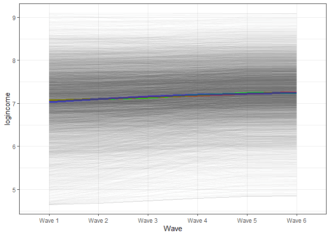
We see a very similar trend for the final model. It would appear that the trend here does not show a non-linear trajectory.
Finding the best fit
How do you decide on the best model? We can compare relative fit indices, like AIC and BIC, to help us with the decision (note that models are not nested, so can’t use the Chi-squared test):
anova(fit1, fit2, fit3)

## Chi-Squared Difference Test
##
##      Df   AIC   BIC  Chisq Chisq diff Df diff Pr(>Chisq)
## fit2 12 97516 97622 168.39
## fit3 12 97761 97867 413.27     244.88       0
## fit1 16 97863 97941 523.41     110.14       4  < 2.2e-16 ***
## ---
## Signif. codes:  0 '***' 0.001 '**' 0.01 '*' 0.05 '.' 0.1 ' ' 1
Based on AIC and BIC, the best-fitting model is the one with square effects. That being said, it’s always important to consider whether those effects are really important from a substantive point of view and whether using just a linear model would really lead to different conclusions.
Conclusions
Hopefully, that will give you an idea of how to estimate non-linear LGM, how to visualize this change, and how to interpret it. Visualizing these models is always helpful, as the interpretation can get quite tricky.
If you liked this, you could look at other blog posts, such as this introduction to multilevel modelling for longitudinal data or this one visualizing transition in time for categorical variables. You can also learn how to include time-constant and time-varying predictors in LGM models here and here.
Was the information useful?
Consider supporting the site: