Working with longitudinal data is exciting as we can see how people, societies and institutions change in time. Often, it helps to visualize this change to understand better what is happening and to help tell a good story. While visualizing change in time for continuous variables is relatively straightforward, it is a little more complicated when we have categorical variables. One solution to this is the Sankey plot/river/alluvial graph. Here, I’m going to show you how to create such a plot in R.
Here are the packages we will be using:
# package for data cleaning and graphs
library(tidyverse)

# package for alluvial plots
library(ggalluvial)

# optional

# nice themes
library(ggthemes)

# nice colors
library(viridis)
As an example data source, I will use the survey outcomes from five waves of the Understanding Society Innovation Panel. This is part of some methodological work we have been doing to understand how people answer using different interview modes (like face-to-face and web) at different times in a longitudinal study.
# load local data
data <- read.csv("./data/ex_trans.csv")

# have a look at our data
head(data)

##   id          out_5   out_6          out_7          out_8      out_9
## 1  1            F2f     Web            Web            Web        Web
## 2  2            F2f     Web            Web            Web        Web
## 3  3 Other non-resp     Web            Web            Web        Web
## 4  4 Other non-resp     Web Other non-resp Other non-resp Not-issued
## 5  5            F2f     F2f            Web            Web        Web
## 6  6 Other non-resp Refusal            Web        Refusal        Web
Cleaning the data
So we have the data in wide format, where each row is an individual (“id” = individual), and then we have the outcomes at five waves (5 to 9).
The first thing we need to do is to summarize the data. What we need is a count of all the possible transitions that can take place in our data. There are a couple of ways of doing that, but the easiest is to use the count() command with the outcome variables. We also create a unique ID, which is just the row number in the dataset, so we can quickly identify the unique patterns later on.
%>% is called a pipe and just lets us chain multiple commands in a way that is easy to read. It takes the results from what is on the left of it and gives it as input to the command to the right.
# calculate all combinations, make unique id and save
data2 <- count(data, out_5, out_6, out_7, out_8, out_9) %>%
  mutate(id = row_number()) # create new id variable

# look at data
head(data2)

##   out_5 out_6 out_7      out_8          out_9  n id
## 1   F2f   F2f   F2f        F2f            F2f 73  1
## 2   F2f   F2f   F2f        F2f     Not-issued  6  2
## 3   F2f   F2f   F2f        F2f Other non-resp 10  3
## 4   F2f   F2f   F2f        F2f        Refusal  2  4
## 5   F2f   F2f   F2f        F2f            Web 12  5
## 6   F2f   F2f   F2f Not-issued            F2f  1  6
So far, so good. We have a nice dataset with all possible combinations of transitions. We must restructure the data to a long format to create the graph. Again, there are many ways to do that, but the easiest is using the gather() command. Here, we say what the data is, the names of the two new variables and any variables we do not want to restructure (-n, -id tells R to ignore these variables when it restructures the data).
# make long data
data3 <- gather(data2, value, key, -n, -id)

# look at data
head(data3)

##    n id value key
## 1 73  1 out_5 F2f
## 2  6  2 out_5 F2f
## 3 10  3 out_5 F2f
## 4  2  4 out_5 F2f
## 5 12  5 out_5 F2f
## 6  1  6 out_5 F2f
The new data tells us the wave, the outcome, and how many cases had that type of transition. We can link different kinds of transitions in the long format using the “id” variable.
Next, we do some data cleaning. We make a continuous version of the wave variable, make the outcome a factor and change the order of the categories (to make the graph easier to interpret).
# clean up data for graph
data4 <- data3 %>%
  mutate(wave = as.numeric(str_remove(value, "out_")),
         key = as.factor(key),
         key = fct_relevel(key, "Web", "F2f", "Refusal",
                           "Other non-resp"))

# look at the data
head(data4)

##    n id value key wave
## 1 73  1 out_5 F2f    5
## 2  6  2 out_5 F2f    5
## 3 10  3 out_5 F2f    5
## 4  2  4 out_5 F2f    5
## 5 12  5 out_5 F2f    5
## 6  1  6 out_5 F2f    5
Doing the graph
We have all we need for our graph now! The ggalluvial package helps us to make the graph we want, but in the background, it uses the ggplot package. This makes it flexible and extensible (as we will see soon).
Using the ggplot() command, we give it the dataset and then the main dimensions of the graph (in aes()):
- on the x-axis, we want time, or “wave” in this case
- on the y-axis, we want the frequency, or “n” in our case
- we want the bar plots at each wave as well as the
fillto depend on our outcome, which here is called “key” alluviumis used to define the transitions. We use the “id” for that
We use two different “geoms” for our graph. First, geom_stratum() creates the bar at each wave. Second, geom_flow() creates the transitions between them. Here, we make the graph slightly transparent to make it easier to read (alpha = .5).
So the syntax looks something like this:
# make basic transition graph
plot <- ggplot(data4, aes(x = wave, y = n,
                          stratum = key, fill = key,
                          alluvium = id)) +
  geom_stratum(alpha = .5) +
  geom_flow()

# print
plot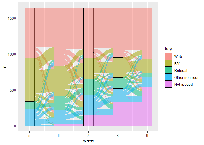
This looks good, but we can make it even better. We will choose a minimalistic theme (theme_tufte()), add labels and give it nicer colours. We can add these to the previously saved object called (creatively) “plot”.
# enhance the look of the graph
plot +
  theme_tufte(base_size = 18) +
  labs(x = "Wave",
       y = "Frequency",
       fill = "Outcome") +
scale_fill_viridis_d(direction = -1) 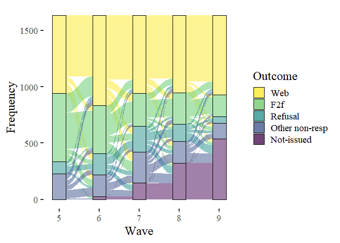
Much nicer.
Want to learn more?
Pre-register for our online course to get early access and discount
So here is the full syntax to make the graph once we have the data prepared:
# full graph syntax
data4 %>%
  ggplot(aes(
    x = wave,
    stratum = key,
    alluvium = id,
    y = n,
    fill = key
  )) +
  geom_flow() +
  geom_stratum(alpha = .5) +
  theme_tufte(base_size = 18) +
  labs(x = "Wave",
       y = "Frequency",
       fill = "Outcome") +
  scale_fill_viridis_d(direction = -1)
Was the information useful?
Consider supporting the site: