Longitudinal data is very exciting as it enables us to look at change in time, get a better understanding of causal relationships and explain events and their timing. To make use of this type of data typically we need to move beyond classical statistical methods, such as OLS regression and ANOVA, to models that can deal with the extra complexity of the data.
One popular model for analyzing longitudinal data is the Latent Growth Model (LGM). This enables the estimation of change in time while taking into account the hierarchical nature of the data (multiple points in times nested within individuals). It is similar to the multilevel model of change but it is estimated using the Structural Equation Modeling (SEM) framework and uses data in the wide format (each row is an individual and measurement in time appears as different columns).
More precisely the LGM can help:
- understand how change happens in time
- explain change using time-varying and time-constant predictors
- decompose variance in between and within variation
- can be easily extended (e.g., mixture LGM, second order LGM, parallel LGM)
Here I’m going to give a brief intro to LGM, how to estimate it and how to visualize change estimates.
Want to really learn? Follow along using the data and code.
Get them when you join the newsletter. Additionally, you will get my 63-point pre-submission checklist for your research. All for free!
First, let’s load the packages. We will use tidyverse for cleaning and visualization of the data and lavaan for running the LGM in R.
library(tidyverse)
library(lavaan)

load("./data/usl_all_syn.RData")

# The guide uses the first six waves and a balanced sample.
usw <- usl_all |>
  filter(wave <= 6) |>
  pivot_wider(
    names_from = wave,
    values_from = logincome,
    names_prefix = "logincome_"
  ) |>
  drop_na(logincome_1:logincome_6)

usl <- usl_all |>
  filter(pidp %in% usw$pidp, wave <= 6)
The balanced six-wave sample contains 21,178 respondents and 127,068 respondent-wave observations.
Before we get into LGM let’s have a look at the kind of data we would want to analyse. Here I use log income from the first six waves of synthetic data based on the Understanding Society survey. The original study is a large representative panel of the UK population collected every year.
Let’s imagine we are interested in how income changes in time. More precisely, we want to see how income changes on average as well as separating between variation, how people change compared to others, and within variation, how people vary relative to their own average/trend.
First, let’s see how the data looks like. Let’s look at the wide data, this is the data used to run LGM:
head(usw)

## # A tibble: 6 × 7
##    pidp logincome_1 logincome_2 logincome_3 logincome_4 logincome_5 logincome_6
##   <int>       <dbl>       <dbl>       <dbl>       <dbl>       <dbl>       <dbl>
## 1     1        7.26        7.08        7.01        6.92        7.22        7.18
## 2     7        6.01        6.14        6.10        5.72        4.26        4.41
## 3     8        6.59        6.54        6.58        6.78        6.72        6.54
## 4    11        2.30        2.30        2.30        2.30        2.31        7.25
## 5    12        5.64        8.09        5.82        5.75        6.08        6.62
## 6    13        6.23        6.17        6.31        6.34        6.27        6.50
Next, let’s look at the long format where each row is a combination of individual and time. This is the format we need for visualization using ggplot2 and for other models (like the multilevel model for change).
head(usl)

## # A tibble: 6 × 3
##    pidp  wave logincome
##   <int> <int>     <dbl>
## 1     1     1      7.26
## 2     1     2      7.08
## 3     1     3      7.01
## 4     1     4      6.92
## 5     1     5      7.22
## 6     1     6      7.18
To get an understanding of what we will be modelling, let’s plot a reproducible sample of 2,000 individual trajectories and calculate the red average line from the full balanced sample.
set.seed(20260803)
plot_ids <- sample(unique(usl$pidp), 2000)

observed_means <- usl |>
  group_by(wave) |>
  summarise(logincome = mean(logincome), .groups = "drop")

usl |>
  filter(pidp %in% plot_ids) |>
  ggplot(aes(wave, logincome, group = pidp)) +
  geom_line(alpha = 0.01) +
  geom_line(
    data = observed_means,
    aes(wave, logincome),
    inherit.aes = FALSE,
    linewidth = 1.5,
    colour = "red"
  ) +
  theme_bw() +
  labs(x = "Wave", y = "Log income")
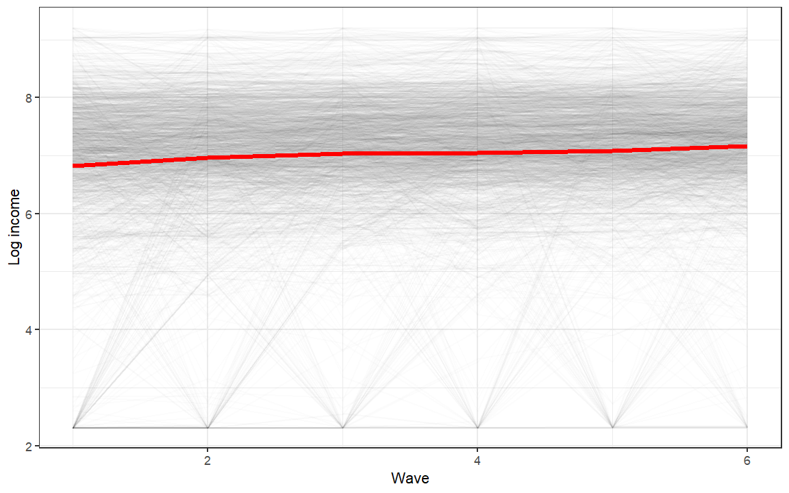
So we see we have an average change in time that we want to estimate but also quite a lot of variation in the way people change. LGM is able to estimate both at the same time!
What is Latent Growth Modelling?
So now that we have an idea about the data and the kind of research questions we might have we can move to the LGM. The formula for the LGM is actually very similar to the one for the multilevel model of change:
yj = α0 + α1λj + ζ00 + ζ11λj + ϵj
Where:
- yj is the variable of interest (logincome for us) that change in time, j.
- α0 represents the average value at the start of the data collection (the starting point of the red line above).
- α1λj is the average rate of change in time (the slope of the red line in the graph above). Here λj just represents a measure of time.
- ζ00 is the between variation at the start of the data. Summarises how different are the individual starting points compared to the average starting point.
- ζ11λj is the between variation in the rate of change. Summarizing how different are the individual slopes of change compared to the average change (red line above).
- ϵj is the within variation or how much individuals vary around their predicted trend.
We can get a better idea of the different sources of variation in the graph below:
example_ids <- usw |>
  slice_head(n = 2) |>
  pull(pidp)

usl |>
  filter(pidp %in% example_ids) |>
  ggplot(aes(wave, logincome, colour = factor(pidp))) +
  geom_point() +
  geom_smooth(method = "lm", se = FALSE) +
  theme_bw() +
  labs(x = "Wave", y = "Log income", colour = "Respondent")
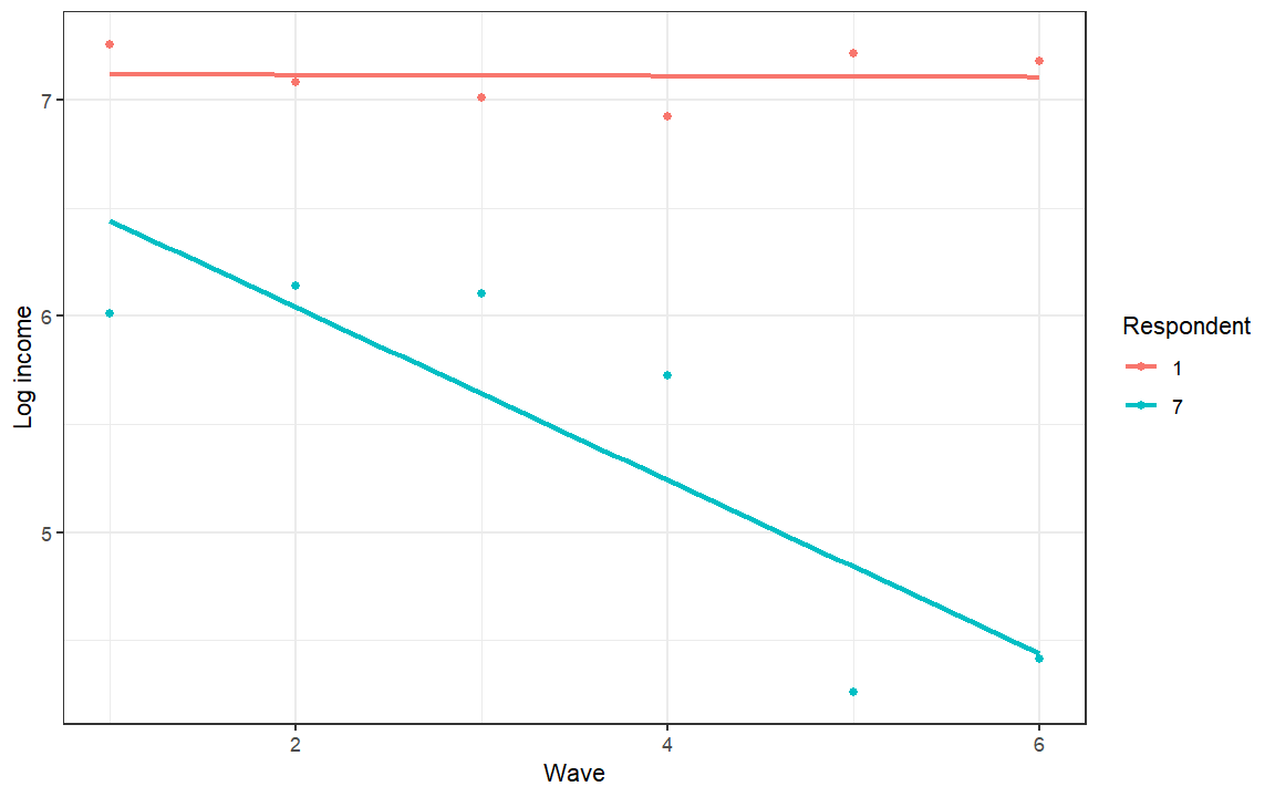
The within variation is represented by the distance between the line and the points. This is done separately for each individual (by colour in the graph). The between variation refers to how different are the lines. This could be either the starting point or the slope.
Structural Equation Modeling has its own way of representing these statistical relationships. Here is how we would represent the model described above:
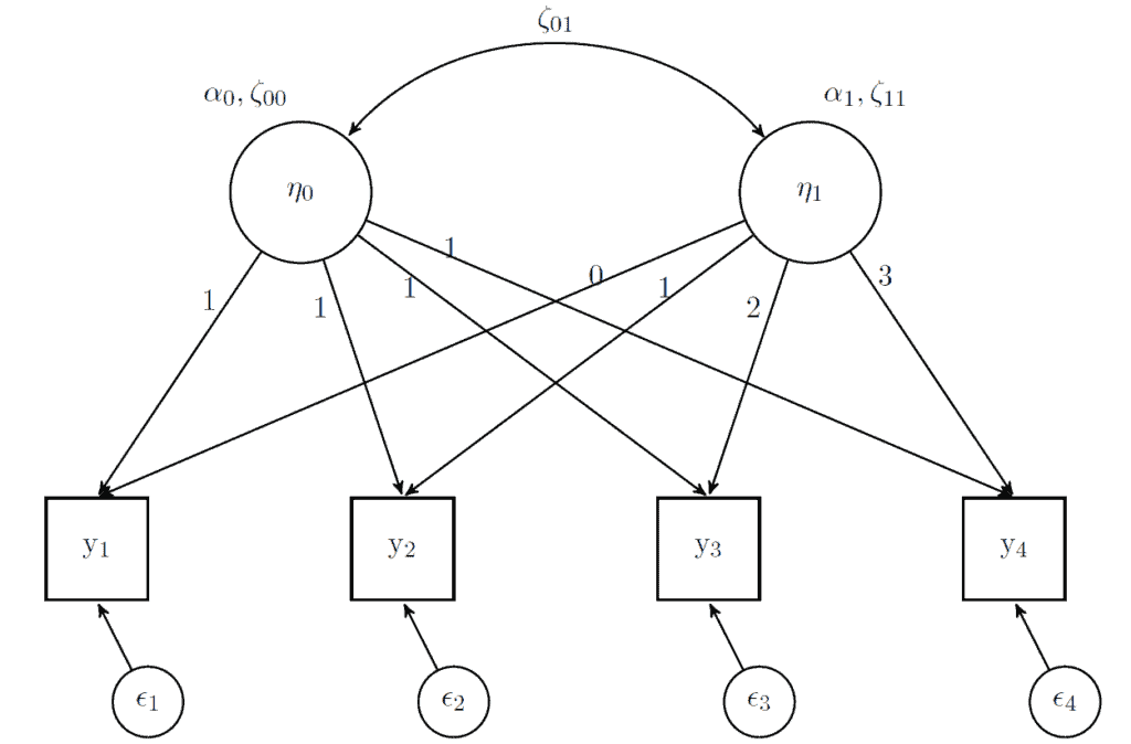
In this framework, latent variables are represented by circles (the two η variables) while observed variables are represented by squares (the four y variables). We also get the residuals (small circles representing ϵ). For the latent variables, we have averages (α) and variances (ζ). These are estimated and have the interpretation described before. The arrows between the latent and observed variables (which are just regression slopes or loadings) are fixed in advance. For the intercept latent variable (represented by η0) the loadings are fixed to 1 (that is why there is nothing multiplied with α0 and ζ00 in the formula above). The loadings for the slope latent variable (represented by η1) are fixed according to the change in time (λj in the formula above). In this case it simply goes from 0 to 3. We also correlate the starting point and the change in time, represented by the double arrow ζ01. This is not often interpreted but it basically gives you an idea that people are converging (or become more similar in time) or diverging (becoming more different).
Now with the technical part out of the way, we can do some modelling and more graphs!
How to estimate Latent Growth Models in R?
Now we will apply the model above. Here I split the process in three parts: writing the syntax for the model and saving it as an object, running the model using the growth() command and look at the summary.
We use logincome measured at six points in time (“logincome_1” to “logincome_6”). We estimate two latent variables, “i” representing the intercept and “s” representing the slope, using the =~ command. To run the model we also fix the loadings in advance (as seen in the figure before) to “1” for the intercept and as time (0 to 5) for the slope.
# first LGM
model <- 'i =~ 1*logincome_1 + 1*logincome_2 + 1*logincome_3 +
                1*logincome_4 + 1*logincome_5 + 1*logincome_6
          s =~ 0*logincome_1 + 1*logincome_2 + 2*logincome_3 +
                3*logincome_4 + 4*logincome_5 + 5*logincome_6'

fit1 <- growth(model, data = usw)

summary(fit1, standardized = TRUE)

## lavaan 0.6-19 ended normally after 40 iterations
##
##   Estimator                                         ML
##   Optimization method                           NLMINB
##   Number of model parameters                        11
##
##   Number of observations                         21178
##
## Model Test User Model:
##
##   Test statistic                              1122.274
##   Degrees of freedom                                16
##   P-value (Chi-square)                           0.000
##
## Parameter Estimates:
##
##   Standard errors                             Standard
##   Information                                 Expected
##   Information saturated (h1) model          Structured
##
## Latent Variables:
##                    Estimate  Std.Err  z-value  P(>|z|)   Std.lv  Std.all
##   i =~
##     logincome_1       1.000                               1.121    0.791
##     logincome_2       1.000                               1.121    0.908
##     logincome_3       1.000                               1.121    0.955
##     logincome_4       1.000                               1.121    0.970
##     logincome_5       1.000                               1.121    0.981
##     logincome_6       1.000                               1.121    1.003
##   s =~
##     logincome_1       0.000                               0.000    0.000
##     logincome_2       1.000                               0.166    0.135
##     logincome_3       2.000                               0.333    0.284
##     logincome_4       3.000                               0.499    0.432
##     logincome_5       4.000                               0.666    0.583
##     logincome_6       5.000                               0.832    0.745
##
## Covariances:
##                    Estimate  Std.Err  z-value  P(>|z|)   Std.lv  Std.all
##   i ~~
##     s                -0.116    0.003  -44.994    0.000   -0.622   -0.622
##
## Intercepts:
##                    Estimate  Std.Err  z-value  P(>|z|)   Std.lv  Std.all
##     i                 6.885    0.009  801.397    0.000    6.144    6.144
##     s                 0.056    0.002   33.268    0.000    0.334    0.334
##
## Variances:
##                    Estimate  Std.Err  z-value  P(>|z|)   Std.lv  Std.all
##    .logincome_1       0.751    0.010   74.715    0.000    0.751    0.374
##    .logincome_2       0.473    0.006   74.687    0.000    0.473    0.310
##    .logincome_3       0.473    0.006   83.529    0.000    0.473    0.344
##    .logincome_4       0.527    0.006   87.255    0.000    0.527    0.394
##    .logincome_5       0.533    0.006   83.182    0.000    0.533    0.409
##    .logincome_6       0.460    0.007   64.709    0.000    0.460    0.368
##     i                 1.256    0.015   81.824    0.000    1.000    1.000
##     s                 0.028    0.001   44.340    0.000    1.000    1.000
There are six types of coefficients that are interesting here:
- intercept i: the value 6.885 represents the average expected logincome at the start of the study for all the respondents.
- intercept s: the value 0.056 represents the average rate of change for all the respondents. So with each wave log income goes up by 0.056.
- variance i: the value 1.256 represents the between variation at the start of the study. So how different are people compared to the average.
- variance s: the value 0.028 represents the between variation in the rate of change. It shows how different are change slopes for different people.
- variance logincome: the values ranging from 0.460 to 0.751 represent the within variation at each point in time.
- correlation between i and s: the value -0.622 highlights that people’s income converges in time.
How to visualize change?
A good way to understand what you are modelling is to visualize the predicted scores from your model. We will use the predict() command to save a new object with the individual-level predicted scores for the intercept and slope.
# predict the two latent variables
pred_lgm <- predict(fit1)
This has the predicted score for the intercept and slope for each individual:
head(pred_lgm)

##             i           s
## [1,] 7.015034  0.03169830
## [2,] 5.920918 -0.11830624
## [3,] 6.541709  0.04652843
## [4,] 2.268350  0.48729258
## [5,] 6.440448  0.01116318
## [6,] 6.188213  0.07281722
These are based on our model. So, for example, we could estimate the mean of these variables and it should give us the same results as above:
# average of the intercepts
mean(pred_lgm[, "i"])

## [1] 6.885196

# average of the slopes
mean(pred_lgm[, "s"])

## [1] 0.05565429
To plot the results we want to transform this data (intercept (η0) and slope (η1)) into expected scores at each wave (yj). We can do this transformation based on the path model we have seen in above:
yj = η0 + η1λj
So, for the first wave the expected value is just the intercept (η0) because λj is equal to 0. For the second wave, the expected value would be the intercept (η0), slope (η1). For wave three it would be intercept + 2 * slope, and so on.
In R we could calculate all these waves by hand or we could do it automatically using a loop or functional programming. Based on the formula above we can create a counterpart in R:
pred_lgm[, 1] + x * pred_lgm[, 2]
where x represents our coding of time (or λj). We can apply this function multiple times using the map() command. The syntax below applies this formula for the numbers 0, 1, 2, 3, 4, 5 (our coding of time).
map(0:5, # what to loop over, in this case numbers 0 to 5
    function(x) pred_lgm[, 1] + x * pred_lgm[, 2]) # formula to use
All of this hopefully should give you an intuition how the latent variables translate in expected values in our original data. Below I build on this formula and make a long dataset that has the predicted scores for the individuals at different waves. We can then use this to do nice plots using ggplot2.
A good way to understand syntax is to run it in stages. So you could first just run the map() command, then map() and reduce() together and so on, to understand what each step does.
# create long data for each individual
pred_lgm_long <- map(
  0:5,
  function(x) pred_lgm[, "i"] + x * pred_lgm[, "s"]
) |>
  reduce(cbind) |>
  as.data.frame() |>
  setNames(str_c("Wave ", 1:6)) |>
  mutate(id = row_number()) |>
  pivot_longer(-id, names_to = "wave", values_to = "pred")

set.seed(20260803)
predicted_plot_ids <- sample(unique(pred_lgm_long$id), 2000)

predicted_means <- pred_lgm_long |>
  group_by(wave) |>
  summarise(pred = mean(pred), .groups = "drop")

pred_lgm_long |>
  filter(id %in% predicted_plot_ids) |>
  ggplot(aes(wave, pred, group = id)) +
  geom_line(alpha = 0.01) +
  geom_line(
    data = predicted_means,
    aes(wave, pred, group = 1),
    inherit.aes = FALSE,
    linewidth = 1.5,
    colour = "red"
  ) +
  theme_bw() +
  labs(y = "Log income", x = "Wave")
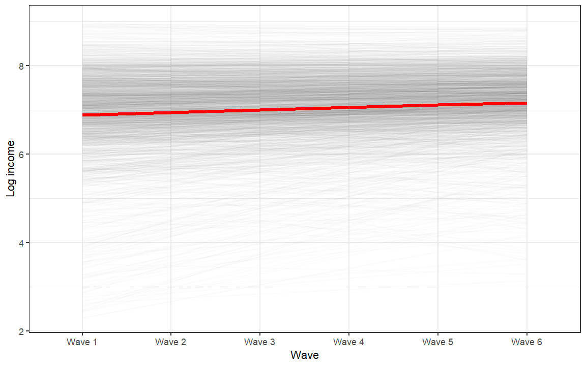
This is the predicted change over time based on our model. The red line starts at about 6.885 and increases by about 0.056 per wave. The individual lines have different starting points and rates of change, and this diversity is captured by the two latent variance estimates.
Want to really learn? Follow along using the data and code.
Get them when you join the newsletter. Additionally, you will get my 63-point pre-submission checklist for your research. All for free!
Conclusions
Hopefully, that gives you an idea about what is LGM, how to estimate it in R and how to visualize change using it. If you liked this you can check the follow-up post that shows how to estimate non-linear change using LGM or see how this model compares to the multilevel model for change. You can also learn how to include time-constant and time-varying predictors in LGM models here and here and how to run parallel LGM here. Also, this post looking at visualizing transition in time for categorical variables might be of interest.
If you have questions feel free to post them in the comments below.
Want to take your skills to the next level? Join our next live course to learn how to efficiently prepare and explore data as well as the main frameworks for analysing longitudinal data.